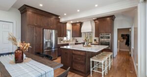
After picture of a newly renovated kitchen in Ambler

Classic Meets Contemporary: A Gorgeous Kitchen Remodel in Ambler

The Transformation of Ewa and Michael’s Kitchen

When Ewa and Michael bought their home, a 1990s-built property with plenty of charm, they thought they had found their dream house. However, after living in the kitchen for just a year, they realized it didn’t align with their lifestyle or modern design tastes. The kitchen was dark and ornate, with a French Country formal style that didn’t resonate with the simplicity and light they craved. Stylized corbels, awkwardly placed appliances, and dated three-dimensional wall tiles created a space that felt closed off and impractical. After careful consideration, they decided it was time for a complete kitchen remodel, and they turned to Creative Contracting to help them bring their vision to life.

Pain Points of a Dated Design

Before picture of an Ambler kitchen with dark cabinets

Ewa and Michael’s kitchen had several design challenges, all of which impacted the way they used the space. The overall aesthetic felt heavy and outdated. The corbels, while ornate, took up visual space and detracted from the clean lines they desired. 

Image of an Ambler kitchen before renovations with 3D tile design

The 3D wall tiles, once trendy, now felt bulky and outdated.

Before images of a kitchen in Ambler with a large island

Additionally, the placement of the appliances created awkward workflows, making meal prep and cooking more cumbersome than it should be.

One of the primary challenges the couple faced was the issue with the cabinetry. The existing cabinets stopped short of the ceiling, creating a space above them that did nothing more than collect dust. This area was both impractical and unsightly, taking away from the streamlined, contemporary look Ewa and Michael envisioned. Moreover, the ceiling angles above the sink created a challenge when it came to extending the cabinetry.

The Design-Build Solution: A Thoughtful, Elegant Transformation

Image of a renovated kitchen in Ambler. A black and white cat sits on a stool in the renovated kitchen

Creative Contracting worked closely with Ewa and Michael to overcome these pain points and turn their kitchen into a bright, functional, and modern space. The design centered around creating clean lines, maximizing functionality, and introducing elegant yet understated touches that would stand the test of time.

One of the first things addressed was the cabinetry. Extending the cabinets all the way to the ceiling was key to eliminating the dust-collecting gap and giving the kitchen a more polished, custom look. Despite the challenges presented by the angled ceiling, our team was able to incorporate a seamless cabinetry design that perfectly fit the space while enhancing its aesthetic appeal.

Image of a renovated kitchen in Ambler with white cabinets and high-end stove

The cabinetry was paired with sleek, modern luxury appliances from Wolf and SubZero. Though Ewa and Michael had some experience with these high-end appliances, their visit to the Wolf SubZero Experience Center at the Naval Yard in Philadelphia, accompanied by Kim and Bob from Creative Contracting, was invaluable. Seeing the appliances in action during a chef-prepared meal allowed them to make informed decisions about what would work best for their new kitchen. The end result? State-of-the-art appliances that not only look stunning but also deliver superior functionality.

Custom Storage Solutions

Storage was another key area that Ewa and Michael wanted to improve. The kitchen’s original design lacked effective storage solutions, leaving clutter on countertops and creating unnecessary frustration. To solve this, Creative Contracting introduced several unique and practical storage features.

Peg system drawer in a newly renovated kitchen in Ambler

One standout feature was the adjustable peg storage system, which allowed Ewa and Michael to organize their dinnerware with ease, keeping everything in its place while making it easily accessible.

Hanging pan system in new renovated kitchen in Ambler

A dedicated space for hanging frying pans added a professional chef-like feel to the kitchen, while maximizing the available space. This clever storage option keeps cookware close by and conceals it when they are not in use.

Seamless Appliance Integration for a Streamlined Look

Custom coffee maker integrated into the cabinetry of this newly renovated kitchen in Ambler

In addition to the unique storage solutions, Ewa and Michael’s kitchen was further elevated by the integration of the Wolf Transitional Coffee System, seamlessly built into their custom cabinetry. This built-in coffee maker not only adds a touch of luxury but also eliminates the need for countertop appliances, freeing up valuable workspace and reducing clutter. Its sleek design blends effortlessly with the surrounding cabinetry, enhancing the kitchen’s streamlined look. Plus, the convenient self-cleaning function ensures that every cup is brewed perfectly without the hassle of cumbersome cleanup, offering a café-quality experience in the comfort of home.

Custom refrigerator in a newly renovated kitchen in Ambler

One of the most striking features of Ewa and Michael’s kitchen remodel is the SubZero counter-depth refrigerator, perfectly centered on the wall and seamlessly integrated with custom cabinetry panels. This thoughtful design creates a cohesive, streamlined look, making the refrigerator appear as an extension of the surrounding cabinetry. Above the cabinets, transom glass adds a touch of sophistication and allows extra light to filter into the space, brightening the kitchen and enhancing its open feel.

Built-in microwave drawer in the island of a custom kitchen in Ambler

Equally impressive is the integration of the Wolf Transitional Microwave Drawer into the island. By placing the microwave in this discreet location, the homeowners maintained clean sight lines while keeping the appliance easily accessible. This clever design not only frees up valuable counter space but also adds to the kitchen’s overall functionality, ensuring a sleek, uncluttered look without sacrificing convenience.

Design Details that Elevate

No transformation is complete without the perfect finishing touches. Ewa and Michael’s kitchen redesign featured a classic black-and-white color scheme with a modern twist. Hanstone quartz countertops in Black Coral and Montauk provided the durability they needed while adding a sleek, contemporary look.

Custom white cabinetry surround a window above the sink of a newly renovated kitchen in Ambler.

The backsplash, a timeless combination of Carrera and black marble, added just the right amount of visual interest without overwhelming the space. Complementing this was the Brizo Litze faucet, featuring black and knurled gold finishes and an angled neck that beautifully bridged the gap between modern and traditional design.

Carrera and black marble backsplash in newly renovated kitchen in Ambler

For added convenience, an insta-hot matching faucet was installed, making it easier for the homeowners to access hot water instantly—a small but significant addition that enhanced the kitchen’s functionality.

From Dark and Ornate to Light and Classic

The transformation of Ewa and Michael’s kitchen is a testament to the power of thoughtful design and expert craftsmanship. By addressing the pain points of the old space—ornate details, awkward appliances, lack of storage, and outdated features—Creative Contracting was able to create a kitchen that feels timeless, elegant, and, above all, functional. From the extension of the cabinetry to the ceiling to the inclusion of high-end Wolf and SubZero appliances, every detail was carefully considered to meet the homeowners’ needs and design preferences.

What was once a dark, formal kitchen is now a light, airy space with a classic, transitional design that Ewa and Michael will enjoy for years to come.

Contact us today to start your journey toward the kitchen of your dreams. 

A modern bathroom featuring a black granite countertop with double sinks, a glass-enclosed sauna labeled "Sunlighten mPulse," a large bathtub with surrounding patterned tiles, and a wicker laundry basket reminiscent of those found in stylish kitchen renovations. The room is lit with recessed lighting.

A Family-Filled Space Evolves Into a Luxurious Bathroom Spa Retreat

As the cool breezes of fall start rolling in, now is the perfect time to take a closer look at your home and consider how you can create the sanctuary you’ve always dreamed of. At Creative Contracting, we’ve been helping homeowners in Lansdale and beyond turn their vision of luxurious, functional spaces into reality for over two decades. There’s no better example of this than Mark and Linda’s basement remodel, which transformed their once-bustling family hub into an opulent private bathroom spa. This stunning bathroom remodel showcases how evolving needs and tastes can inspire a whole new level of luxury and relaxation.

Evolving Needs: A Shift from Activity to Tranquility

Transforming Traditions: A Fun-filled Family Hub Evolves into a Luxury Spa

Mark and Linda’s story began with a space that was once the center of family life. The basement had hosted everything from kids’ sleepovers and family movie nights to workout sessions and craft projects. But as their children grew up and life shifted, so did their priorities. Mark and Linda decided it was time to reclaim the basement as a space for themselves—a personal retreat where they could unwind and focus on their wellness.

And what better place to start than with the bathroom? For Mark and Linda, the vision was clear: they wanted a luxurious spa-like experience that would rival any high-end retreat. After decades of using the basement for family activities, it was transformed into a high-end wellness sanctuary and luxury spa.

A Spa-Like Experience at Home: Luxury Redefined

The new bathroom in Mark and Linda’s basement is nothing short of indulgent. It’s a space designed not just for function, but for the ultimate spa experience—a place where you can escape from the world and relax in luxury. Imagine stepping into a bathroom where every detail has been carefully considered to bring you comfort, relaxation, and rejuvenation.

Luxury bathroom with Encaustic tile design

At the heart of this stunning bathroom is an oversized soaking tub, perfect for unwinding after a long day. With the help of a convenient ice maker located right in the bathroom, you can quickly fill the tub with refreshing, ice-cold water for a true spa-like experience. Paired with a large walk-in shower complete with modern matte black fixtures, this bathroom offers both practicality and pampering.

Towel-warming drawer in a remodeled basement spa-like bathroom

But the luxury doesn’t stop there. The bathroom also features a towel-warming drawer, ensuring you always have a warm, cozy towel ready when you step out of the tub or shower. 

Washer and dryer located in a spa-like bathroom remodel


Modern Aesthetics: A Blend of Style and Function

The aesthetic of this luxury bathroom is nothing short of breathtaking. Mark and Linda wanted a space that felt both modern and inviting, and that’s exactly what the Creative Contracting team delivered. The design combines sleek industrial touches with warm, natural elements, creating a space that feels both edgy and elegant.

An image of a spa-like bathroom with two LED mirrors and encaustic tile wall

Bold encaustic tiles serve as the focal point of the room, perfectly complementing the dark tile floors and black marble countertops. White custom cabinetry offers ample storage while balancing the room’s bold design elements.

Brushed nickel hooks in a spa-like bathroom remodel

The fixtures in this bathroom are carefully chosen to complement the overall aesthetic. From matte black to brushed nickel, each piece adds to the modern, sleek feel of the space. The result is a bathroom that feels like a high-end spa, but with the comfort and convenience of home.

Illuminating Ambiance: Setting the Right Mood

Luxury spa bathroom with dark tile flooring, dark marble countertops, white custom cabinetry and a sauna

In a room with no natural light, lighting is everything. For Mark and Linda, lighting was a key consideration in their bathroom redesign. To create a warm, inviting atmosphere, we incorporated soft, ambient lighting throughout the space. The bathroom walls, finished with a hand-applied plaster technique, gleam under the soft glow of carefully placed lights, giving the room a calming, spa-like feel.

For an added touch of luxury and ambiance, battery-operated flickering candles in large rattan holders were placed throughout the space. Not only do they add a soft, ambient glow, but they also serve as a practical solution for safety, especially with the family’s cats. 

Image of the door in a spa-like bathroom remodel with a cut-out for cats to access the room

And to ensure that their feline companions weren’t left out, we customized the bathroom doors to allow easy access to their kitty litter boxes, seamlessly integrating their needs without sacrificing the serene spa environment.

Bringing the Vision to Life: Overcoming Challenges With Creativity 

Luxury state-of-the-art sauna in a spa-like bathroom remodel

One of the most impressive aspects of this bathroom transformation was the installation of the enormous sauna. It was too large to fit through the basement doors, so our team took on the challenge of lowering it through the upstairs family room floor. This innovative solution allowed us to install the state-of-the-art sauna without damaging any part of the family’s living space. Today, you’d never know the family room floor had been touched.

Now Is the Time to Transform Your Space

With fall fast approaching, it’s the perfect time to think about how you can reenvision your home, especially the bathroom. Whether you’re dreaming of a luxurious spa retreat or a more functional space to meet your everyday needs, Creative Contracting is here to help bring your vision to life.

Mark and Linda’s stunning bathroom transformation serves as a reminder that our spaces should evolve with us. As we move into a new season, it’s time to consider how your home can be reimagined to fit your lifestyle and personal taste.

Contact us today to start your journey toward the bathroom of your dreams. Whether it’s a complete redesign or a small upgrade, Creative Contracting is here to turn your ideas into reality. Your luxurious bathroom awaits!

Spacious modern kitchen renovation with gray cabinets, white countertops, and a central island with two dark chairs. A backsplash with shades of gray and blue complements the decor. Large windows provide ample natural light, and various kitchen items adorn the countertops.

A Dream Realized: A Montgomery County Kitchen Transformation

The Need for Change

When Joe and Lori decided to upgrade their kitchen in their Montgomery County colonial, they were eager to create a space that matched their needs and lifestyle. The original kitchen was a far cry from what they envisioned—it was dark, cramped, and lacked the functionality they craved.


A kitchen with wooden cabinets, a black refrigerator, white dishwasher, microwave, and various items on the countertops. A dining table with chairs is in the center, holding papers and a few other objects. A floral valance is above the windows, and the word "Before" is in the top left corner, highlighting this space as ripe for kitchen renovation.

Identifying the Challenges

During our initial consultation process, they shared their frustrations: a cramped sink area, dishwasher location, minimal counter space around the wall ovens and range, and outdated Corian countertops paired with old wood cabinets that offered little in the way of storage. To top it off, the kitchen’s lone light fixture hung awkwardly above the table, casting a dim light over the space. With a tiny wall housing their microwave, stovetop, wall ovens, and refrigerator, it was clear this kitchen needed a significant transformation to become the spacious, stylish, and functional hub the couple desired.

A Strategic Redesign

One of the biggest challenges was the placement of the dishwasher, which was inconveniently located far from the sink, at the end of a stretch of cabinetry. The original floor plan lacked functionality and offered very little to the flow of the space for ease of cooking and entertaining.

Floor plans of this Montgomery County kitchen before the renovation.
Floor plans of the original kitchen.

Joe and Lori wanted a new floor plan that would allow more than one person to comfortably work in the kitchen, especially when entertaining guests. 

Floor plans of the kitchen proposing the new layout.
Floor plans of the kitchen with the new layout.

Our design team saw an opportunity to drastically improve the kitchen’s layout by making a few strategic changes: relocating the refrigerator and wall ovens, creating an appealing focal point, moving the dishwasher closer to the sink, and adding a functional island. And by moving the doorway that connects the kitchen to the dining room by just 10 inches, we unlocked the potential to completely transform the space. 

A 3D rendering of a modern kitchen renovation features gray cabinets, a white marble countertop island, stainless steel double ovens, and a cooktop.
3D Rendering of Joe and Lori’s kitchen.

We expertly transformed Joe and Lori’s initial floor plans into highly detailed 3D renderings, allowing them to see their dream kitchen come to life before any construction began. These realistic visuals provided a clear representation of how we addressed every challenge, ensuring that their vision was perfectly captured. Thanks to our team’s expertise, Joe and Lori could confidently visualize their new space, knowing exactly what to expect long before the first hammer was lifted.

Creating a New Focal Point

A modern kitchen renovation with light grey cabinets, white countertops, and a tiled backsplash. An island with wine and oil bottles, accompanied by two black chairs, is central. Large windows offer a view of greenery outside. "After" is written in the upper left corner.

Moving the refrigerator and wall ovens to the opposite wall gave us the chance to create a stunning focal point with a custom wood range hood above the new stove, complete with a ledge for displaying the couple’s cherished stoneware. 

A recent kitchen renovation showcases gray cabinetry, a white countertop, and a backsplash with gray and blue tiles. Decorative plates are displayed in a wooden compartment above the stove. The background reveals a dining area with red wallpaper and wooden flooring.

This not only freed up space but also allowed for a more efficient and aesthetic arrangement.

A modern kitchen renovation features light grey cabinetry, a double wall oven, and a stainless steel refrigerator. A bright window reflected in the oven door adds natural light, and a white countertop is partially visible in front. Framed artwork hangs on the wall in the background.

We relocated the dishwasher next to the sink, making it much more convenient for clean-up. With these changes, counter space became easily accessible from both the sink and range, a crucial improvement for a kitchen meant for both cooking and gathering.

Modern kitchen renovation with light gray cabinets, white countertops, and stainless-steel appliances including a dishwasher. The island has a white countertop with dark wooden stools. The backsplash features blue and gray tiles, and the floor is wood. A window brings in natural light.

A Functional and Stylish Space

A modern kitchen renovation with light gray cabinets and a matching island. The countertop is white, and the backsplash consists of blue-gray tiles. Two black barstools are placed at the island. The kitchen features hardwood flooring and a few decorative items.

We introduced a small, functional island that comfortably seats two, but with a few extra barstools, it can accommodate up to four people for an informal dinner. The trade-off of losing a large in-kitchen dining table was more than worth it, as the modernized layout now offers a more functional and open workspace. When their adult children are home for family dinners, Joe and Lori make great use of their dining room, which is just steps away.

Design Details That Shine

A modern kitchen sink with a tall, curved faucet set in a sleek white countertop. Next to the sink, there's a decorative bowl holding red apples on a wooden cutting board with gold handles. A white towel is placed on the cutting board. The backsplash features blue and gray tiles, perfect for any kitchen renovation.

Joe and Lori opted for a single-bowl stainless steel sink with a disposal button, making the kitchen both convenient and sleek. 

A kitchen counter, fresh from a recent renovation, features a decorative bowl with red pomegranates set against a patterned blue, gray, and brown tile backsplash. Nearby, a mortar and pestle sit on a wooden tray alongside a bottle of olive oil.

They carefully selected cabinetry and a backsplash that would create a soft, neutral backdrop for their blue stoneware collection.

A modern kitchen renovation with light gray cabinets and white marble countertops. The backsplash features rectangular blue-gray tiles. Sunlight streams through the large windows, offering a view of greenery outside. Decorative pitchers are thoughtfully placed on the counter.

The taupe-stained wood cabinets add a touch of warmth, while the blue-shaded tile provides a subtle but striking pop of color. Recessed lighting and a neutral paint palette enhance the bright and airy atmosphere of the new kitchen. The removal of the soffits allowed us to extend the cabinets to the ceiling, maximizing storage space, and giving the kitchen a more polished look. 

A modern kitchen renovation with taupe cabinetry, white quartz countertops, and stainless steel appliances. A center island with a white countertop and two chairs provides seating. The backsplash is made of blue-gray tiles, and the floor features medium-tone wood planks.

Finally, luxury vinyl flooring in a complementary tone replaced the outdated tile, adding durability and style.

A Space to Enjoy

The result is a kitchen that Joe and Lori can truly enjoy—a space where they can entertain friends and family without feeling cramped or confined. The kitchen, now the true heart of their home, is bright, open, and perfectly suited to their lifestyle.

Ready to Transform Your Kitchen?

Are you ready to transform your outdated kitchen into a space that reflects your vision and meets your needs? At Creative Contracting, we’re here to help you bring your dream kitchen to life. Contact us today to discuss your remodeling options and discover how we can turn your home into the perfect setting for your life.

Remodeled kitchen with white cabinets, tile backsplash and granite counter tops

Breathing New Life Into the Kitchen of a 1920s Home on the Main Line


A Fresh Transformation for a Classic Home

In the heart of the picturesque Main Line, nestled among charming Craftsman-style homes, stood a sweet little twin home from the 1920s. Its owner, Sharon, cherished the historical essence of her residence but recognized the need to modernize. With a cramped 6 x10 ft kitchen and limited amenities, the time had come to transform the space while honoring its storied past. This is where Creative Contracting stepped in, ready to blend innovation with tradition, and with our talented architectural interior designer, Leila Maloney leading the way, the vision began to take shape. 

Opening Up the Space

Before image of a kitchen on the Main Line

This renovation project was not just about updating the look but enhancing the overall functionality and comfort of the kitchen. Our team at Creative Contracting approached the project with meticulous attention to detail, ensuring that every element contributed to a cohesive and inviting space. The existing kitchen felt more of a closet than a culinary space, stifling Sharon’s love for cooking and entertaining.

Blueprint

Leila’s first suggestion was bold but necessary: remove the wall between the dining room and the kitchen. As you can see from the before and after floor plans, this single change reoriented the entire layout, providing an open, inviting expanse of working surface and creating a flow that the old layout sorely lacked. 

Renovated kitchen on the Main Line in PA showing an open back door

By changing the location of the doorway, the kitchen not only grew in size but also gained a new sense of accessibility and freedom of movement. Uninterrupted counter space makes this new kitchen a dream to prepare, cook and entertain.

Carving Out a Powder Room

Renovated kitchen showing beverage center and pocket door to powder room

One of Sharon’s top wishes for her home was to carve out space for a small powder room. In a house with limited square footage, this was no small feat. However, with some clever design thinking, we made it happen. By eliminating an existing closet and converting the basement door into a sleek pocket door, we found the perfect spot for a tiny powder room. 

Renovated powder room with original architectural details in built-in shelf

A corner sink was installed, providing the necessary function without overwhelming the space. The basement, which Sharon fondly referred to as her wine cellar, was now accessible through the bathroom’s pocket door—a design decision that elegantly solved two problems at once. Adding a second bathroom to the home was a significant convenience, and its thoughtful placement within the original footprint was a triumph of ingenuity.

Maintaining Historical Charm

Original architectural details in revovated powder room

Our skilled carpenter, Jeff, contributed to the charm and functionality of the new powder room by replicating a built-in nook within the original framing. This not only provided additional storage but also preserved the home’s historical character, adding a craftsman detail that seamlessly blended the old with the new.

Reimagining the Kitchen Layout

Beverage center of renovated kitchen on the Main Line in PA

The kitchen transformation didn’t stop with the removal of walls and relocation of doors. The refrigerator, previously confined to a tight corner, was moved to a more functional location, freeing up space for a small beverage area—a delightful addition for Sharon, who loves to entertain. Every detail of the cabinetry was carefully considered for both aesthetic appeal and practical use. 

The new layout achieved the perfect symmetry that the client had been longing for, combining visual harmony with outstanding functionality.

Renovated kitchen with white cabinets, granite counter tops and stainless steel stove and dishwasher

Finishing Touches

Renovated kitchen showing original windows and drawers

Kim, our Selections Designer, played a crucial role in the finishing touches that brought the entire design together. Sharon wanted a look that was timeless yet fresh, and Kim’s suggestions hit the mark perfectly. Dove white cabinets provided a crisp, clean backdrop that brightened the space. Warm white countertops added a touch of softness and elegance, while a gently textured backsplash introduced subtle visual interest. Pewter hardware completed the look, adding a touch of vintage charm that paid homage to the home’s heritage.

Honoring the Past, Building for the Future

Original archway of renovated kitchen in a home on the Main Line

The transformation of Sharon’s kitchen on the Main Line was a labor of love for the entire Creative Contracting team. It was more than just a renovation; it was about creating a space that respected the past while embracing the present.

Renovated kitchen of a 1920s home on the Main Line

Sharon’s home is now a testament to what can be achieved with thoughtful design, skilled craftsmanship, and a deep appreciation for history. Creative Contracting took great care in preserving the original windows and drawers in the dining room, seamlessly integrating them into the new design. This careful attention to detail ensures that the home’s historical charm remains intact while providing modern functionality. We are proud to have been part of this transformative journey.

Contact Us for Your Design-Build Needs

Are you ready to transform your home while preserving its unique history? Let Creative Contracting bring your vision to life with our blend of innovative design and expert craftsmanship. Contact us today to discuss your remodeling needs and discover how we can make your dream home a reality. Start your journey today with Creative Contracting.

Transforming a Dark, Dated Kitchen into a Bright, Modern Marvel in North Wales

Transforming a Dark, Dated Kitchen into a Bright, Modern Marvel in North Wales

Fresh Update and a New Look

After 20 years of living with a well-loved kitchen, a North Wales couple decided it was time for a renovation. The floors had been updated, but the dark, functional kitchen was beginning to show its age. With plans to downsize within the next 10 years or so, they faced a crucial decision: brighten the kitchen with some paint, new countertops, and backsplash, or invest in new cabinetry for a complete transformation.

A fresh coat of paint would have brightened the kitchen but wouldn’t address the low-hanging replacement microwave above the stove, which required cabinet modification. It also wouldn’t change the cabinet style—face-framed raised panel with arched panels on the upper cabinets. Painting would have merely refreshed the cabinets, not made them look new. Furthermore, the floors had recently been updated. Given that investment, the homeowners were understandably reluctant to modify the cabinet configuration. .

After much research and reflection, the couple decided to replace their cabinets, backsplash, countertops, and appliances. Their new transitional-style kitchen boasts cleaner lines, brighter colors, and a fresh outlook that reflects their outgoing personalities. While this renovation did not involve a significant change in the floor plan, it offered more than a simple change in style and feel. The full overlay cabinetry optimized interior space, providing functional improvements, as well. Soft close cabinetry, drawers, accessible pull-outs, and new options for ease of access in corner cabinets significantly improved storage. Plus the uninterrupted base of blue cabinetry creates the customized look and feel they desired around the refrigerator and dishwasher.

Lighting upgrades, including under-cabinet lighting, LED recessed lighting, plus a chandelier over the kitchen table with coordinating pendants over the peninsula island, brightened the space significantly. 

Each finish was thoughtfully selected, from the decision to opt for a beautiful quartz countertop with subtle blue veining, enhancing the cohesive color scheme, to the stunning natural marble backsplash. Hardware and light pendants were bold choices in a two-toned metal finish of matte black and honey gold. Walls painted in Benjamin Moore’s Edgecomb Gray add a neutral backdrop that easily extends to the adjoining spaces.

The Transformation Process

This renovation project was not just about updating the look but enhancing the overall functionality and comfort of the kitchen. Our team at Creative Contracting approached the project with meticulous attention to detail, ensuring that every element contributed to a cohesive and inviting space.

Initial Consultation and Design Phase

During the initial consultation, we listened carefully to the homeowners’ desires and concerns. As mentioned earlier, the homeowners expressed a need for a brighter, more modern kitchen without altering the existing floor plan. Our design team proposed a transitional style that would offer timeless appeal while incorporating modern conveniences.

Demolition and Installation

The first step in the transformation was to remove the old cabinets, countertops, and backsplash. This process was handled with care to avoid damaging the recently updated floors. Once the space was cleared, we began installing the new full overlay cabinetry. The homeowners chose a stunning shade of blue for the base cabinets, which added a pop of color and a contemporary feel to the kitchen. Making the upper cabinets white not only coordinated beautifully with the backsplash, it made the space feel large and expansive.

Countertops and Backsplash

The selection of the quartz countertops with subtle blue veining was a game-changer. It tied together the blue base cabinetry and white upper cabinets, and added a touch of elegance. The natural marble backsplash was another highlight, offering a luxurious texture and a timeless look that complemented the white upper cabinets and quartz countertops beautifully.

Lighting and Hardware

Upgrading the lighting was crucial to enhancing both the functionality and ambiance of the kitchen. The combination of under-cabinet lighting, a statement chandelier, elegant pendants, and dimmable LED recessed lights created a versatile lighting scheme. The two-toned metal finish of the hardware and light pendants in matte black and honey gold added a sophisticated touch, balancing modernity with warmth.

Final Touches

The walls painted in Benjamin Moore’s Edgecomb Gray provided a perfect neutral backdrop that seamlessly connected the kitchen to the adjoining living spaces. This neutral palette ensured that the kitchen felt integrated with the rest of the home, creating a harmonious flow.

A Kitchen Built for the Future

This project was a joy to work on because every choice made was aimed at enhancing the homeowners’ happiness every time they walked into their kitchen. They didn’t want their update to feel like “a pig in lipstick.” Never fear! This kitchen is stunning and chic! The couple couldn’t be happier with their refreshed kitchen that meets all their needs for the present and future.

At Creative Contracting, we pride ourselves on turning our clients’ dreams into reality. This kitchen renovation is a testament to our dedication and expertise. If you’re ready to transform your kitchen into a space that reflects your unique style and enhances your daily life, contact us today to schedule a consultation. With our guidance and craftsmanship, your dream kitchen is closer than you think.

A modern kitchen with white cabinets, grey countertops, and a grey island with two pendant lights. The dining area features a wooden table with white chairs. Large windows with butterfly-patterned valances let in ample natural light, showcasing a green lawn outside.

Gorgeous in Grey: Turning a Cramped, Dated Kitchen into a Spacious, Modern Marvel

As the heart—and hub—of the home, a modern kitchen should make it easy for a family to cook and connect while beautifully representing their personal style. At Creative Contracting, we understand that every kitchen renovation is a unique opportunity to transform not just a space, but the way our clients live and create cherished memories in their homes.

Dark, cramped, and cut off from the rest of the main floor, our recent clients’ 30-year-old kitchen was in desperate need of an update that would give them a functional space to enjoy for many more years in their beloved home. The homeowners knew they wanted a brighter, more open layout that would allow for better flow and more family time spent together in the kitchen.

The Challenges

A classic older kitchen, this space featured a U-shaped, one-person work area that confined the home chef, making it difficult to host while preparing a meal. Soffits, peninsula cabinets and lowered ceiling heights blocked natural light, while Formica countertops, dated track lighting almond-toned appliances, and the original cabinets painted off-white all added up to a dated look that felt far from the modern, inviting space the homeowners envisioned.

In terms of functionality, the kitchen didn’t have enough room for the whole family to gather without feeling overwhelmed. While the eating area could comfortably seat six, it was awkwardly placed between the prep area and the neighboring living room, creating a flow that didn’t quite work for the family’s needs.

A New Layout

To open up the space, our expert team began by removing the soffits and overhanging cabinets to let in the light from the windows in the original eating area.

We then removed the old pantry closet and adjoining wall to reposition the refrigerator and microwave for easy access. A countertop cubby that houses the landline phone, charging station and mail drop also provides the perfect spot to set plates from the microwave.

With the peninsula gone, a new island with plenty of storage and an integrated outlet serve as a functional focal point, allowing for easy flow—and conversation—into the dining area. Our passion for crafting seamless transitions shines through in this transformed space, creating a kitchen that feels open, airy, and connected to the rest of the home.

Fantastic Finishes

A soft gray and neutral color palette brings a fresh, clean brightness to the new space.

Crisp white Shaker-style cabinets around the perimeter blend well with a textured gray subway tile backsplash, which reflects the light with its sheen. In contrast, the island’s light gray cabinet base adds a layer of interest while picking up the tone of the new LVF flooring and the upgraded stainless-steel appliances.

Quartz countertops with just the right amount of veining add definition, while cabinet pulls in a beautiful mid grey serve as just the right finishing touch.

Details Matter

We love walking our clients through the many selections available to achieve their personal vision. In this kitchen, quartz countertops with just the right amount of gray veining add definition and coordinate beautifully with the white and gray cabinets, gray tile backsplash, and the warm-toned flooring. For any project, hardware is like a jewelry accessory. Here, the new Ash Gray Top Knobs pulls add the perfect pop – not too light, and not too dark – just right! 

Finally, a lovely vent hood above the stove and new induction cooktop serves as a stunning alternative to the old microwave that originally sat in the same space. The new appliances not only look great but also provide the homeowners with the latest in cooking technology, making meal preparation a breeze.

Functional Details

The improved functionality of the kitchen reaches beyond the added counterspace. After removing the track lights and overhead cabinets, we brightened up the space with new LED recessed lights, gorgeous glass pendants, and under-cabinet lighting—all controlled by dimmable switches—to create the perfect ambiance or workspace. The layered lighting design ensures that the homeowners have the right illumination for any task, whether it’s cooking, cleaning, or simply enjoying a quiet moment in their new space.

Storage is always an issue for any kitchen, so we designed this one with deep cabinet drawers throughout the space and custom pantry cabinets surrounding the fridge. These thoughtful storage solutions provide ample space for everything from cookware and small appliances to dry goods and cleaning supplies, keeping the kitchen organized and clutter-free. Furthermore, a deep sink makes it easy to temporarily conceal dirty pots and pans during a dinner party; and speaking of messes, the luxury vinyl flooring we selected is one of the most practical options on the market for cleaning up spills and withstanding high-traffic areas.

Finally, with the old peninsula gone, the dining area feels larger than ever—and much more connected to the activity in the main part of the kitchen. The homeowners now have a space that can comfortably accommodate family and friends, whether they’re gathered around the island for a casual meal or seated at the dining table for a special occasion.

Built for the Future

Our clients couldn’t be happier with this refreshed kitchen that hits all the right notes for their family’s lifestyle and aesthetic. After decades of a too-small space, our clients can now enjoy an open concept that’s perfect for connecting with loved ones and building memories for many years to come. The improved layout, updated finishes, and enhanced functionality all contribute to a kitchen that truly serves as the heart of their home.

At Creative Contracting, we’re dedicated to turning our clients’ dreams into reality, and this kitchen renovation is a testament to our expertise and passion. If you’re ready to transform your kitchen into a space that reflects your unique style and enhances your daily life, contact us today to schedule a consultation. With our guidance and craftsmanship, your dream kitchen is closer than you think.

A two-story house with stone and white siding exterior, blue shutters, and a gable roof is surrounded by a well-manicured lawn and various green shrubs. A tree is in the foreground on a sunny day with a clear blue sky.

Spring Home Maintenance Checklist: 10 Things to Review After Winter

With April in full swing and the summer season just around the corner, it’s the perfect time to give your home a thorough check-up. Spring is a season of renewal, and just like nature, our homes need some extra care and attention to ensure they’re ready for the upcoming months. To help you get started, we’ve put together a list of 10 essential things to review in your home after the winter.

  1. Inspect your roof: Winter weather can be tough on your roof. Look for any missing, damaged, or loose shingles and schedule repairs if needed.
  1. Clean your gutters: Clogged gutters can cause water damage to your home’s foundation. Clear out any debris and ensure that water is flowing freely.
  1. Check your windows and doors: Look for any gaps or cracks in your windows and doors that may have developed during the winter. Seal them to improve energy efficiency and prevent drafts.
  1. Service your HVAC system: Schedule a professional tune-up for your air conditioning system to ensure it’s ready for the summer months ahead.
  1. Inspect your foundation: Check for any cracks or signs of moisture in your home’s foundation. Address any issues promptly to prevent further damage.
  1. Test your smoke and carbon monoxide detectors: Replace the batteries in your smoke and carbon monoxide detectors and test them to ensure they’re working correctly.
  1. Clean your dryer vent: A clogged dryer vent can be a fire hazard. Clean it out to improve your dryer’s efficiency and safety.
  1. Inspect your deck or patio: Look for any signs of damage or wear and tear on your outdoor living spaces. Make necessary repairs and consider giving them a fresh coat of stain or paint.
  1. Check your plumbing: Look for any leaks or signs of water damage around your pipes, toilets, and sinks. Address any issues promptly to prevent costly repairs down the line.
  1. Tidy up your landscaping: Remove any dead branches or debris from your yard, and trim back any overgrown plants or trees. This will improve your home’s curb appeal and prevent potential damage to your property.

By taking the time to review these 10 essential items in your home, you’ll ensure that your property is ready for the spring and summer months ahead. To make it even easier for you, we’ve created a handy checklist you can download and print out for your convenience.

[Download Your Free Spring Home Maintenance Checklist]

A spacious outdoor patio with a wooden dining set for six, situated on a stone-tiled surface. A modern grill is set against a raised stone wall with wooden railing. Nearby, stone steps lead up to a higher terrace, and the area is surrounded by lush greenery.

Revitalize Your Outdoor Living Space for Summer

Living in the Northeast grants us the gift of experiencing the full spectrum of seasonal changes. As the weather warms up, we look forward to longer days and seeing nature come back to life. After a cold and gray winter, spring brings a sense of renewal, inspiring us to spend more time outside and enjoy the fresh air. One of the best ways to make the most of longer days and much-needed sunshine is through a new outdoor living space. Having a thoughtfully designed outdoor space allows you to enjoy nature, entertain family and friends, and relax in comfort. 

Embracing Outdoor Living

Designing outdoor spaces isn’t just a service we provide; it’s our passion. Whether you’re envisioning a cozy screened-in porch, an inviting outdoor fireplace, or a fully-equipped chef’s kitchen for family barbecues, Creative Contracting is here to transform your dreams into reality. Our expertise lies in crafting seamless transitions from indoor to outdoor living areas, utilizing cutting-edge materials in decking, paving, and exterior maintenance-free products.

Crafting Your Vision

At Creative Contracting, we understand that every outdoor space is unique, reflecting the individual preferences and lifestyle of its owners. Through a comprehensive consultation process, we delve into your aspirations and requirements, guiding you through our design approach. Using advanced technology, we create detailed 3-dimensional renderings, allowing you to visualize your envisioned space with clarity and precision. Let us help you bring your dreams to life!

Turning Vision Into Reality

Once the design phase is complete, we embark on the journey of turning your vision into a tangible masterpiece. Our team develops a meticulous construction plan, complete with a detailed schedule and finalized budget, ensuring transparency and accountability throughout the process. Utilizing our Buildertrend program, you’ll stay informed every step of the way, with daily progress logs, images, and schedules at your fingertips.

Investing in Lasting Enjoyment

Investing in a well-designed outdoor space isn’t just about enhancing your property; it’s about enriching your lifestyle. Imagine basking in the warm glow of the sun on your newly constructed patio, or cozying up by the crackling fireplace under a starlit sky. These moments of connection with nature are not only restorative but often become cherished memories for our clients, transforming their outdoor oasis into their favorite retreat.

Experience the Creative Contracting Difference

As you prepare to embrace the joys of outdoor living this summer, let Creative Contracting be your trusted partner in transforming your outdoor space. Reach out to us today to schedule a consultation and take the first step towards creating your perfect outdoor sanctuary. With our expertise and dedication, your dream outdoor retreat is closer than you think.

Contact Creative Contracting today and let us help you make this summer one to remember!

An indoor swimming pool with blue mosaic tiles, surrounded by beige deck with floor skylight windows. The room has large windows on the left wall letting in natural light and colorful, gradient sunset wall mural. An air conditioning unit is mounted on back wall.

Creating an Indoor Endless Pool for Family Therapy and Fun

Meeting Special Therapy Needs

When Doug and Christina found themselves facing the challenge of suspended therapy sessions for their son due to pandemic closures, they knew they needed a solution. Their son’s special therapy needs prompted them to explore options for year-round access to a pool. Water therapy offers a myriad of health benefits, especially for individuals with specific therapeutic requirements. Thus, the idea of an indoor Endless Pool was born.

The Home Addition

To accommodate their vision, a small home addition was incorporated into their home, adjacent to the existing sunroom. This addition seamlessly connected to the house, providing convenient access to the pool from both the sunroom and a staircase leading from the garage. 

The split-level design of their home made it effortless to access pool equipment from the garage. Safety regulations were diligently met by ensuring the stairs could be folded away when not in use, ensuring a secure pool entrance.

Family Excitement

While the primary motivation for the pool was the therapeutic needs of their son, it quickly evolved into a source of excitement for the entire family. All three children, along with their parents, eagerly anticipated the endless possibilities the pool offered. From leisurely floating with pool noodles to the invigorating exercise of swimming laps against the Endless Pool’s current options, there was something for everyone to enjoy.

A Visionary Touch

Nestled against a backdrop of a picturesque golf course with stunning sunsets, the family’s daughter had a vision. She imagined the walls of the pool room adorned with colors mirroring the breathtaking sunset views they cherished. Collaborating with Katie DuBree of katiedubreedesigns.com, the family meticulously selected the hues for the walls. Together, they envisioned the warm, orange glow of the sun setting in the west corner of the room, bringing the beauty of the outdoors inside.

The Ultimate Exercise: Fun

This family’s journey from a suspended therapy session to the creation of an indoor Endless Pool was not just about fulfilling a need; it was about embracing possibilities, fostering connections, and cherishing moments of sheer happiness.

For Creative Contracting, the most gratifying aspect of this project was witnessing a loving family come together to create a special place where fun transcended mere activity. Beyond addressing therapeutic needs, the indoor Endless Pool became a sanctuary where laughter, joy, and bonding flourished. It exemplified how a thoughtful addition could not only cater to practical requirements but also enrich the lives of those it serves. 
Ready to see what the possibilities can be for your next renovation? Get started today by contacting our talented team.

Lansdale aging in place addition exterior view

The Full Reveal: An Aging in Place Addition in Montgomery County

Navigating the large layout of a two-story colonial was not what our clients had in mind as they entered their golden years. Well aware of the changes they needed to make to overcome the challenges of climbing stairs in their current home, this Lansdale couple explored luxury senior living as well as ranch homes in the area. They sought a solution that would not only meet their current needs but also cater to their evolving requirements.

After an exhaustive investigation and a realization of the limits within the housing market, the couple made a smart decision – they chose to enhance their existing home. The addition of a first-floor primary bedroom suite became the cornerstone of their plan, allowing them to remain in the home and neighborhood that holds a special place in their hearts.

A Thoughtful and Contemporary Primary Suite

Lansdale Primary suite

Opting for a more contemporary aesthetic in their new addition, the couple embraced a sophisticated palette of grays and warm neutrals. The primary bedroom suite offers a spacious haven, complete with a small sitting area for moments of quiet reflection. Beautiful glass-paned French Doors were designed to allow no-step access to the expanded patio, creating a harmonious flow between the indoors and outdoors.

Lansdale custom closet

A custom-designed closet in the bedroom provides extra storage, ensuring everything has its place. Pocket doors were thoughtfully designed to maximize the space and provide an uninterrupted flow into the large walk-in closet.

Balancing Beauty and Functionality in This Primary Bathroom

Lansdale aging in place primary bathroom

In the primary bathroom, we strike a perfect balance between beauty and functionality. A double vanity takes center stage, featuring a rich espresso wood and a sleek marble countertop. The brushed nickel fixtures and large-format tile floor display various shades of gray and infuse the space with a sense of sophistication, while the black metal arch mirrors provide a modern touch.

Lansdale aging in place addition bathroom

To meet the practical needs of the homeowners, custom cabinetry has been seamlessly integrated into the primary bathroom. This addition not only enhances the aesthetic appeal but also provides extra storage for clothing and laundry essentials. Ensuring a cohesive design, a makeup table in the same rich espresso wood as the double vanity perfectly complements all the cabinetry in this inviting primary bathroom.

Lansdale aging in place shower images

The homeowners’ forward-thinking approach to their future needs was remarkable. To suit both their current lifestyle and future considerations, we crafted a fully accessible, threshold-free shower featuring a bench and a tiled niche for storage. ADA-compliant grab bars ensure safety without compromising the overall design. The shower walls adorned with light gray textured tiles add a touch of sophistication to this walk-in shower, complemented by dark gray floor tiles and a matching shower niche that ties in with the overall bathroom floor design.

Creative Contracting Helps Clients Gracefully Age in Place

The completion of this project not only enhanced the functionality of our client’s living space but has also sparked joy and satisfaction knowing they can remain in their cherished home for years to come. If you’re curious about the design intricacies of this transformative project, check out our previous blog post. Our talented team is ready to guide you through a personalized aging-in-place solution. Reach out today for a free consultation, and let’s create a home where you can gracefully age in comfort and style.

Creative Contracting 2023 Year in Review

2023 Year in Review

As 2023 comes to a close, we’re taking a look back at some of the memorable projects we completed for our clients across Montgomery and Bucks counties. 2023 was a big year for kitchen transformations in the Philadelphia suburbs. We’re grateful our clients chose to entrust such a significant home remodel to our Creative Contracting team. If you’re considering a kitchen remodel in the new year, these projects can serve as a great inspiration of what is possible when it comes to kitchen design. 

At Creative Contracting, our approach is always to listen to your needs, understand your style and preferences and turn that into the space you’ve been dreaming of! With our design-build team, we’re the only design- build firm you need to complete a kitchen, bath, whole home remodel or addition project. Now let’s look back at some of those gorgeous kitchens we renovated in 2023.  

Bucks County Kitchen Gets A Sunny and Elegant Refresh

Creative Contracting 2023 Year in Review

This Warminster family came to us because their kitchen didn’t reflect their modern, sophisticated style. Beyond the outdated aesthetic, it lacked light and the dark atmosphere made it feel even more cramped and uninviting. In addition, our clients wanted to find some creative ways to maximize their storage space to make the kitchen much more enjoyable to use. 

Creative Contracting 2023 Year in Review

To address all of these requests, our design team went to work to come up with a strategy to lighten and brighten the space while giving it a modern refresh that included plenty of ingenious storage solutions. This began with the foundational elements of the space: new vinyl plank flooring in a warm spring oak color and crisp white custom shaker cabinetry which added plenty of elevated architectural elements to the space. 

Creative Contracting 2023 Year in Review

From there, we added in two types of complementary countertops in natural black stone and white quartz to add visual interest. We removed a cumbersome above-the-sink window and replaced it with a trio of windows for more user-friendly operation.

Finally, we added in the finer details to create a fresh, refined look. These included brushed gold cabinet hardware, dimmable task lighting and gold chandelier-style pendant lighting, along with a natural Carrara marble tile to further warm up the space. And to address those storage concerns, we crafted an oversized island with ample drawers and shelving to handle pantry staples and all of those kitchen gadgets that should be close at hand. The end result is a bright, inviting space that is sure to welcome the family in from Sunday breakfast to weeknight dinners. 

From Basic Kitchen to Breathtaking in Montgomery County

Creative Contracting 2023 Year in Review

In Wynnewood, a family’s love for cooking together sparked a kitchen transformation request: bring in more light, more space, and more connection to the outdated kitchen. Their old kitchen felt isolated from the rest of the living spaces. And the style left a lot to be desired. So our team went to work, dismantling walls that were breaking up the flow of conversation and connection. The result is an open, airy kitchen space that harmoniously connects with the surrounding living areas. 

Creative Contracting 2023 Year in Review

Our clients connected with the right, classic feel of navy blue, so we used this color for the shaker cabinets and accented it with brushed gold pulls and a timeless gray subway tile for the backsplash. Wide plank flooring brings a touch of warmth to the space and a gorgeous range hood and spacious island create focal points that invite both the family and their guests to be a part of their culinary passion. 

Modern Farmhouse Gets an Elevated Touch in Montgomery County, PA

Creative Contracting 2023 Year in Review

Rounding out some of our favorite kitchen remodels we completed in the past year is this light and airy Montgomery kitchen transformation. What made this kitchen remodel particularly memorable was the amount of small detail decisions we guided our clients through. 

Creative Contracting 2023 Year in Review

We assisted in incorporating warm, natural elements into the white, modern space, starting with the traditional red oak floors and extending to the gorgeous white oak island. Every detail, from the custom shelving and a charging storage cabinet to the addition of floor-length windows and a striking Brizio luxury faucet, was deliberately chosen to enhance the style and atmosphere of the space.
Upgrade your kitchen, enhance your daily experience, and create lasting memories in an inviting space. Imagine the possibilities for the upcoming holiday season. Whether it’s your kitchen or any other area in your home, the Creative Contracting team is ready to assist you in completely renovating your space, making it more functional and visually appealing. Reach out to us, and we’ll be with you every step of the way.

White Kitchen in Warminster

Embracing Timeless Elegance: The White Kitchen Reimagined

Navigating the winding path of a major home renovation can lead to a plethora of questions. One hot topic in the kitchen realm? The color conundrum. White kitchens, while wildly popular, often create hesitation among homeowners. Fear not! White kitchens aren’t just a trend; they’re a timeless staple. Worried your white haven might lack character? Think again. The possibilities to enhance your all-white kitchen are as abundant as the spice aisle. Here are a handful of our favorite kitchens, proving that a white kitchen is the ultimate canvas for versatility.

Dress Up Your Kitchen With Seasonal Colors

Montgomery County White Kitchen with Pops of Color
White and Black Kitchen with pops of Yellow

This kitchen features a clean white and black design with custom cabinetry, providing an ideal canvas for adding touches of seasonal color. In this case, we chose splashes of yellow for the client. The original travertine floors seamlessly complement the new custom cabinetry and natural stone backsplash. Accent lighting plays a crucial role, and the uniformity of the glass elements contributes to enlarging the space and infusing it with a sense of brightness and warmth.

Transcend Trends with Transitional Design

Transitional Kitchen with White Cabitnetry

The white cabinetry in this family-friendly entertainment space adopts a more contemporary vibe, enhanced by non-mullioned glass on both cabinets and windows, streamlining the overall design. Classic elements, such as traditional hardware and elegant trim, introduce a touch of tradition, resulting in a transitional design for the kitchen.

Beverage bar in Transitional White Kitchen

Soft details like the light gray island and metal screening in the bar sink cabinets add subtle nuances that contribute to the overall stunning appeal of the space.

Use Color and Texture in a White Kitchen

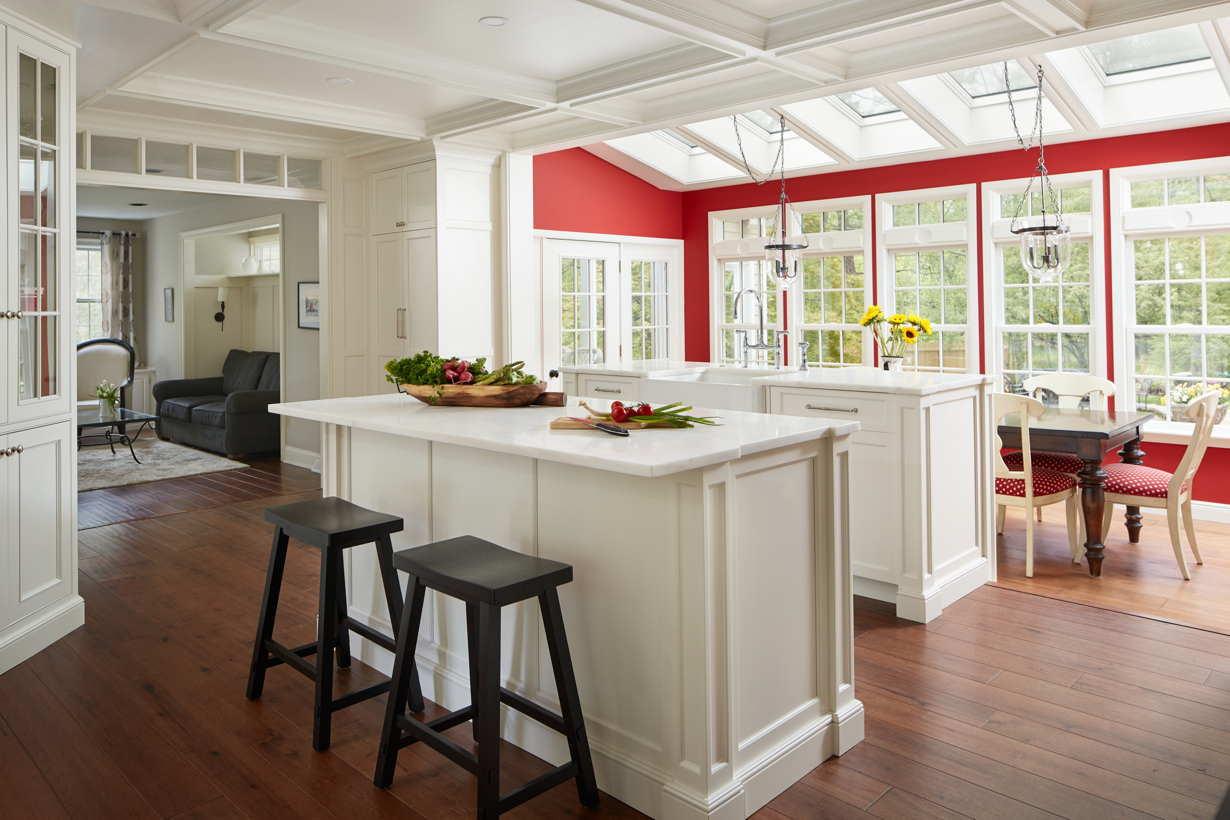
White Kitchen with Red Accents

The coffered ceiling, wainscoting, and cabinet trims showcase classic Hampton-style custom woodwork.

Detail of Basket Weave Backsplash in a White Kitchen

The backsplash, featuring a dimensional basket weave, reinforces the timeless patterns of a family kitchen. Black and white surfaces play a grounding role for the white elements, and the whimsical touch of red accents coordinates seamlessly with the hardworking Wolf range knobs.

Complement White Cabinets With Wood Accents

Lower Gwynedd White Kitchen with Wood Accents

In this elegant family kitchen, a harmonious combination of soft white oak and brushed gold creates a beautiful aesthetic. The newly refinished oak floors, custom-stained to complement the cabinetry, make a stunning visual impact. The expanded French doors contribute to visually enlarging the existing space.

White Oak Shelving and Mantle

Mindfully placed white oak extends to features like shelves with a hidden recharging center and file cabinets, creating a sweet family workspace. The same oak used for these elements also replaces the family room fireplace mantel, ensuring a consistent accent color throughout the entire space.

Infuse Character With Rustic Charm

White Kitchen with Rustic Charm  

This charming in-law suite on a Bucks County farm estate exudes cozy warmth. Embracing the property’s origins, country touches like a honed black granite countertop, beadboard, and bubbled glass contribute to a rustic atmosphere. The use of mixed metals is defined by a traditional faucet, bronze hardware, and copper pots.

In the world of kitchen renovations, the possibilities are as diverse as personal tastes. Your white kitchen can be a canvas for unparalleled creativity and individuality. From subtle rustic accents to bold modern statements, the key is to embrace the unique aspects that reflect your style. Whether it’s a splash of color, textured surfaces, or distinctive hardware choices, these kitchen projects serve as a reminder that your white kitchen can truly stand out. Contact Creative Contracting to explore the possibilities for your renovation.