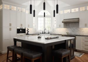
After picture of a newly renovated kitchen in Ambler

Classic Meets Contemporary: A Gorgeous Kitchen Remodel in Ambler

The Transformation of Ewa and Michael’s Kitchen

When Ewa and Michael bought their home, a 1990s-built property with plenty of charm, they thought they had found their dream house. However, after living in the kitchen for just a year, they realized it didn’t align with their lifestyle or modern design tastes. The kitchen was dark and ornate, with a French Country formal style that didn’t resonate with the simplicity and light they craved. Stylized corbels, awkwardly placed appliances, and dated three-dimensional wall tiles created a space that felt closed off and impractical. After careful consideration, they decided it was time for a complete kitchen remodel, and they turned to Creative Contracting to help them bring their vision to life.

Pain Points of a Dated Design

Before picture of an Ambler kitchen with dark cabinets

Ewa and Michael’s kitchen had several design challenges, all of which impacted the way they used the space. The overall aesthetic felt heavy and outdated. The corbels, while ornate, took up visual space and detracted from the clean lines they desired. 

Image of an Ambler kitchen before renovations with 3D tile design

The 3D wall tiles, once trendy, now felt bulky and outdated.

Before images of a kitchen in Ambler with a large island

Additionally, the placement of the appliances created awkward workflows, making meal prep and cooking more cumbersome than it should be.

One of the primary challenges the couple faced was the issue with the cabinetry. The existing cabinets stopped short of the ceiling, creating a space above them that did nothing more than collect dust. This area was both impractical and unsightly, taking away from the streamlined, contemporary look Ewa and Michael envisioned. Moreover, the ceiling angles above the sink created a challenge when it came to extending the cabinetry.

The Design-Build Solution: A Thoughtful, Elegant Transformation

Image of a renovated kitchen in Ambler. A black and white cat sits on a stool in the renovated kitchen

Creative Contracting worked closely with Ewa and Michael to overcome these pain points and turn their kitchen into a bright, functional, and modern space. The design centered around creating clean lines, maximizing functionality, and introducing elegant yet understated touches that would stand the test of time.

One of the first things addressed was the cabinetry. Extending the cabinets all the way to the ceiling was key to eliminating the dust-collecting gap and giving the kitchen a more polished, custom look. Despite the challenges presented by the angled ceiling, our team was able to incorporate a seamless cabinetry design that perfectly fit the space while enhancing its aesthetic appeal.

Image of a renovated kitchen in Ambler with white cabinets and high-end stove

The cabinetry was paired with sleek, modern luxury appliances from Wolf and SubZero. Though Ewa and Michael had some experience with these high-end appliances, their visit to the Wolf SubZero Experience Center at the Naval Yard in Philadelphia, accompanied by Kim and Bob from Creative Contracting, was invaluable. Seeing the appliances in action during a chef-prepared meal allowed them to make informed decisions about what would work best for their new kitchen. The end result? State-of-the-art appliances that not only look stunning but also deliver superior functionality.

Custom Storage Solutions

Storage was another key area that Ewa and Michael wanted to improve. The kitchen’s original design lacked effective storage solutions, leaving clutter on countertops and creating unnecessary frustration. To solve this, Creative Contracting introduced several unique and practical storage features.

Peg system drawer in a newly renovated kitchen in Ambler

One standout feature was the adjustable peg storage system, which allowed Ewa and Michael to organize their dinnerware with ease, keeping everything in its place while making it easily accessible.

Hanging pan system in new renovated kitchen in Ambler

A dedicated space for hanging frying pans added a professional chef-like feel to the kitchen, while maximizing the available space. This clever storage option keeps cookware close by and conceals it when they are not in use.

Seamless Appliance Integration for a Streamlined Look

Custom coffee maker integrated into the cabinetry of this newly renovated kitchen in Ambler

In addition to the unique storage solutions, Ewa and Michael’s kitchen was further elevated by the integration of the Wolf Transitional Coffee System, seamlessly built into their custom cabinetry. This built-in coffee maker not only adds a touch of luxury but also eliminates the need for countertop appliances, freeing up valuable workspace and reducing clutter. Its sleek design blends effortlessly with the surrounding cabinetry, enhancing the kitchen’s streamlined look. Plus, the convenient self-cleaning function ensures that every cup is brewed perfectly without the hassle of cumbersome cleanup, offering a café-quality experience in the comfort of home.

Custom refrigerator in a newly renovated kitchen in Ambler

One of the most striking features of Ewa and Michael’s kitchen remodel is the SubZero counter-depth refrigerator, perfectly centered on the wall and seamlessly integrated with custom cabinetry panels. This thoughtful design creates a cohesive, streamlined look, making the refrigerator appear as an extension of the surrounding cabinetry. Above the cabinets, transom glass adds a touch of sophistication and allows extra light to filter into the space, brightening the kitchen and enhancing its open feel.

Built-in microwave drawer in the island of a custom kitchen in Ambler

Equally impressive is the integration of the Wolf Transitional Microwave Drawer into the island. By placing the microwave in this discreet location, the homeowners maintained clean sight lines while keeping the appliance easily accessible. This clever design not only frees up valuable counter space but also adds to the kitchen’s overall functionality, ensuring a sleek, uncluttered look without sacrificing convenience.

Design Details that Elevate

No transformation is complete without the perfect finishing touches. Ewa and Michael’s kitchen redesign featured a classic black-and-white color scheme with a modern twist. Hanstone quartz countertops in Black Coral and Montauk provided the durability they needed while adding a sleek, contemporary look.

Custom white cabinetry surround a window above the sink of a newly renovated kitchen in Ambler.

The backsplash, a timeless combination of Carrera and black marble, added just the right amount of visual interest without overwhelming the space. Complementing this was the Brizo Litze faucet, featuring black and knurled gold finishes and an angled neck that beautifully bridged the gap between modern and traditional design.

Carrera and black marble backsplash in newly renovated kitchen in Ambler

For added convenience, an insta-hot matching faucet was installed, making it easier for the homeowners to access hot water instantly—a small but significant addition that enhanced the kitchen’s functionality.

From Dark and Ornate to Light and Classic

The transformation of Ewa and Michael’s kitchen is a testament to the power of thoughtful design and expert craftsmanship. By addressing the pain points of the old space—ornate details, awkward appliances, lack of storage, and outdated features—Creative Contracting was able to create a kitchen that feels timeless, elegant, and, above all, functional. From the extension of the cabinetry to the ceiling to the inclusion of high-end Wolf and SubZero appliances, every detail was carefully considered to meet the homeowners’ needs and design preferences.

What was once a dark, formal kitchen is now a light, airy space with a classic, transitional design that Ewa and Michael will enjoy for years to come.

Contact us today to start your journey toward the kitchen of your dreams. 

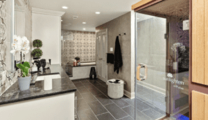
A modern bathroom featuring a black granite countertop with double sinks, a glass-enclosed sauna labeled "Sunlighten mPulse," a large bathtub with surrounding patterned tiles, and a wicker laundry basket reminiscent of those found in stylish kitchen renovations. The room is lit with recessed lighting.

A Family-Filled Space Evolves Into a Luxurious Bathroom Spa Retreat

As the cool breezes of fall start rolling in, now is the perfect time to take a closer look at your home and consider how you can create the sanctuary you’ve always dreamed of. At Creative Contracting, we’ve been helping homeowners in Lansdale and beyond turn their vision of luxurious, functional spaces into reality for over two decades. There’s no better example of this than Mark and Linda’s basement remodel, which transformed their once-bustling family hub into an opulent private bathroom spa. This stunning bathroom remodel showcases how evolving needs and tastes can inspire a whole new level of luxury and relaxation.

Evolving Needs: A Shift from Activity to Tranquility

Transforming Traditions: A Fun-filled Family Hub Evolves into a Luxury Spa

Mark and Linda’s story began with a space that was once the center of family life. The basement had hosted everything from kids’ sleepovers and family movie nights to workout sessions and craft projects. But as their children grew up and life shifted, so did their priorities. Mark and Linda decided it was time to reclaim the basement as a space for themselves—a personal retreat where they could unwind and focus on their wellness.

And what better place to start than with the bathroom? For Mark and Linda, the vision was clear: they wanted a luxurious spa-like experience that would rival any high-end retreat. After decades of using the basement for family activities, it was transformed into a high-end wellness sanctuary and luxury spa.

A Spa-Like Experience at Home: Luxury Redefined

The new bathroom in Mark and Linda’s basement is nothing short of indulgent. It’s a space designed not just for function, but for the ultimate spa experience—a place where you can escape from the world and relax in luxury. Imagine stepping into a bathroom where every detail has been carefully considered to bring you comfort, relaxation, and rejuvenation.

Luxury bathroom with Encaustic tile design

At the heart of this stunning bathroom is an oversized soaking tub, perfect for unwinding after a long day. With the help of a convenient ice maker located right in the bathroom, you can quickly fill the tub with refreshing, ice-cold water for a true spa-like experience. Paired with a large walk-in shower complete with modern matte black fixtures, this bathroom offers both practicality and pampering.

Towel-warming drawer in a remodeled basement spa-like bathroom

But the luxury doesn’t stop there. The bathroom also features a towel-warming drawer, ensuring you always have a warm, cozy towel ready when you step out of the tub or shower. 

Washer and dryer located in a spa-like bathroom remodel


Modern Aesthetics: A Blend of Style and Function

The aesthetic of this luxury bathroom is nothing short of breathtaking. Mark and Linda wanted a space that felt both modern and inviting, and that’s exactly what the Creative Contracting team delivered. The design combines sleek industrial touches with warm, natural elements, creating a space that feels both edgy and elegant.

An image of a spa-like bathroom with two LED mirrors and encaustic tile wall

Bold encaustic tiles serve as the focal point of the room, perfectly complementing the dark tile floors and black marble countertops. White custom cabinetry offers ample storage while balancing the room’s bold design elements.

Brushed nickel hooks in a spa-like bathroom remodel

The fixtures in this bathroom are carefully chosen to complement the overall aesthetic. From matte black to brushed nickel, each piece adds to the modern, sleek feel of the space. The result is a bathroom that feels like a high-end spa, but with the comfort and convenience of home.

Illuminating Ambiance: Setting the Right Mood

Luxury spa bathroom with dark tile flooring, dark marble countertops, white custom cabinetry and a sauna

In a room with no natural light, lighting is everything. For Mark and Linda, lighting was a key consideration in their bathroom redesign. To create a warm, inviting atmosphere, we incorporated soft, ambient lighting throughout the space. The bathroom walls, finished with a hand-applied plaster technique, gleam under the soft glow of carefully placed lights, giving the room a calming, spa-like feel.

For an added touch of luxury and ambiance, battery-operated flickering candles in large rattan holders were placed throughout the space. Not only do they add a soft, ambient glow, but they also serve as a practical solution for safety, especially with the family’s cats. 

Image of the door in a spa-like bathroom remodel with a cut-out for cats to access the room

And to ensure that their feline companions weren’t left out, we customized the bathroom doors to allow easy access to their kitty litter boxes, seamlessly integrating their needs without sacrificing the serene spa environment.

Bringing the Vision to Life: Overcoming Challenges With Creativity 

Luxury state-of-the-art sauna in a spa-like bathroom remodel

One of the most impressive aspects of this bathroom transformation was the installation of the enormous sauna. It was too large to fit through the basement doors, so our team took on the challenge of lowering it through the upstairs family room floor. This innovative solution allowed us to install the state-of-the-art sauna without damaging any part of the family’s living space. Today, you’d never know the family room floor had been touched.

Now Is the Time to Transform Your Space

With fall fast approaching, it’s the perfect time to think about how you can reenvision your home, especially the bathroom. Whether you’re dreaming of a luxurious spa retreat or a more functional space to meet your everyday needs, Creative Contracting is here to help bring your vision to life.

Mark and Linda’s stunning bathroom transformation serves as a reminder that our spaces should evolve with us. As we move into a new season, it’s time to consider how your home can be reimagined to fit your lifestyle and personal taste.

Contact us today to start your journey toward the bathroom of your dreams. Whether it’s a complete redesign or a small upgrade, Creative Contracting is here to turn your ideas into reality. Your luxurious bathroom awaits!

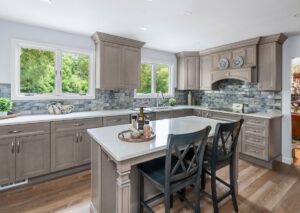
Spacious modern kitchen renovation with gray cabinets, white countertops, and a central island with two dark chairs. A backsplash with shades of gray and blue complements the decor. Large windows provide ample natural light, and various kitchen items adorn the countertops.

A Dream Realized: A Montgomery County Kitchen Transformation

The Need for Change

When Joe and Lori decided to upgrade their kitchen in their Montgomery County colonial, they were eager to create a space that matched their needs and lifestyle. The original kitchen was a far cry from what they envisioned—it was dark, cramped, and lacked the functionality they craved.


A kitchen with wooden cabinets, a black refrigerator, white dishwasher, microwave, and various items on the countertops. A dining table with chairs is in the center, holding papers and a few other objects. A floral valance is above the windows, and the word "Before" is in the top left corner, highlighting this space as ripe for kitchen renovation.

Identifying the Challenges

During our initial consultation process, they shared their frustrations: a cramped sink area, dishwasher location, minimal counter space around the wall ovens and range, and outdated Corian countertops paired with old wood cabinets that offered little in the way of storage. To top it off, the kitchen’s lone light fixture hung awkwardly above the table, casting a dim light over the space. With a tiny wall housing their microwave, stovetop, wall ovens, and refrigerator, it was clear this kitchen needed a significant transformation to become the spacious, stylish, and functional hub the couple desired.

A Strategic Redesign

One of the biggest challenges was the placement of the dishwasher, which was inconveniently located far from the sink, at the end of a stretch of cabinetry. The original floor plan lacked functionality and offered very little to the flow of the space for ease of cooking and entertaining.

Floor plans of this Montgomery County kitchen before the renovation.
Floor plans of the original kitchen.

Joe and Lori wanted a new floor plan that would allow more than one person to comfortably work in the kitchen, especially when entertaining guests. 

Floor plans of the kitchen proposing the new layout.
Floor plans of the kitchen with the new layout.

Our design team saw an opportunity to drastically improve the kitchen’s layout by making a few strategic changes: relocating the refrigerator and wall ovens, creating an appealing focal point, moving the dishwasher closer to the sink, and adding a functional island. And by moving the doorway that connects the kitchen to the dining room by just 10 inches, we unlocked the potential to completely transform the space. 

A 3D rendering of a modern kitchen renovation features gray cabinets, a white marble countertop island, stainless steel double ovens, and a cooktop.
3D Rendering of Joe and Lori’s kitchen.

We expertly transformed Joe and Lori’s initial floor plans into highly detailed 3D renderings, allowing them to see their dream kitchen come to life before any construction began. These realistic visuals provided a clear representation of how we addressed every challenge, ensuring that their vision was perfectly captured. Thanks to our team’s expertise, Joe and Lori could confidently visualize their new space, knowing exactly what to expect long before the first hammer was lifted.

Creating a New Focal Point

A modern kitchen renovation with light grey cabinets, white countertops, and a tiled backsplash. An island with wine and oil bottles, accompanied by two black chairs, is central. Large windows offer a view of greenery outside. "After" is written in the upper left corner.

Moving the refrigerator and wall ovens to the opposite wall gave us the chance to create a stunning focal point with a custom wood range hood above the new stove, complete with a ledge for displaying the couple’s cherished stoneware. 

A recent kitchen renovation showcases gray cabinetry, a white countertop, and a backsplash with gray and blue tiles. Decorative plates are displayed in a wooden compartment above the stove. The background reveals a dining area with red wallpaper and wooden flooring.

This not only freed up space but also allowed for a more efficient and aesthetic arrangement.

A modern kitchen renovation features light grey cabinetry, a double wall oven, and a stainless steel refrigerator. A bright window reflected in the oven door adds natural light, and a white countertop is partially visible in front. Framed artwork hangs on the wall in the background.

We relocated the dishwasher next to the sink, making it much more convenient for clean-up. With these changes, counter space became easily accessible from both the sink and range, a crucial improvement for a kitchen meant for both cooking and gathering.

Modern kitchen renovation with light gray cabinets, white countertops, and stainless-steel appliances including a dishwasher. The island has a white countertop with dark wooden stools. The backsplash features blue and gray tiles, and the floor is wood. A window brings in natural light.

A Functional and Stylish Space

A modern kitchen renovation with light gray cabinets and a matching island. The countertop is white, and the backsplash consists of blue-gray tiles. Two black barstools are placed at the island. The kitchen features hardwood flooring and a few decorative items.

We introduced a small, functional island that comfortably seats two, but with a few extra barstools, it can accommodate up to four people for an informal dinner. The trade-off of losing a large in-kitchen dining table was more than worth it, as the modernized layout now offers a more functional and open workspace. When their adult children are home for family dinners, Joe and Lori make great use of their dining room, which is just steps away.

Design Details That Shine

A modern kitchen sink with a tall, curved faucet set in a sleek white countertop. Next to the sink, there's a decorative bowl holding red apples on a wooden cutting board with gold handles. A white towel is placed on the cutting board. The backsplash features blue and gray tiles, perfect for any kitchen renovation.

Joe and Lori opted for a single-bowl stainless steel sink with a disposal button, making the kitchen both convenient and sleek. 

A kitchen counter, fresh from a recent renovation, features a decorative bowl with red pomegranates set against a patterned blue, gray, and brown tile backsplash. Nearby, a mortar and pestle sit on a wooden tray alongside a bottle of olive oil.

They carefully selected cabinetry and a backsplash that would create a soft, neutral backdrop for their blue stoneware collection.

A modern kitchen renovation with light gray cabinets and white marble countertops. The backsplash features rectangular blue-gray tiles. Sunlight streams through the large windows, offering a view of greenery outside. Decorative pitchers are thoughtfully placed on the counter.

The taupe-stained wood cabinets add a touch of warmth, while the blue-shaded tile provides a subtle but striking pop of color. Recessed lighting and a neutral paint palette enhance the bright and airy atmosphere of the new kitchen. The removal of the soffits allowed us to extend the cabinets to the ceiling, maximizing storage space, and giving the kitchen a more polished look. 

A modern kitchen renovation with taupe cabinetry, white quartz countertops, and stainless steel appliances. A center island with a white countertop and two chairs provides seating. The backsplash is made of blue-gray tiles, and the floor features medium-tone wood planks.

Finally, luxury vinyl flooring in a complementary tone replaced the outdated tile, adding durability and style.

A Space to Enjoy

The result is a kitchen that Joe and Lori can truly enjoy—a space where they can entertain friends and family without feeling cramped or confined. The kitchen, now the true heart of their home, is bright, open, and perfectly suited to their lifestyle.

Ready to Transform Your Kitchen?

Are you ready to transform your outdated kitchen into a space that reflects your vision and meets your needs? At Creative Contracting, we’re here to help you bring your dream kitchen to life. Contact us today to discuss your remodeling options and discover how we can turn your home into the perfect setting for your life.

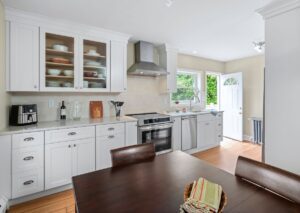
Remodeled kitchen with white cabinets, tile backsplash and granite counter tops

Breathing New Life Into the Kitchen of a 1920s Home on the Main Line


A Fresh Transformation for a Classic Home

In the heart of the picturesque Main Line, nestled among charming Craftsman-style homes, stood a sweet little twin home from the 1920s. Its owner, Sharon, cherished the historical essence of her residence but recognized the need to modernize. With a cramped 6 x10 ft kitchen and limited amenities, the time had come to transform the space while honoring its storied past. This is where Creative Contracting stepped in, ready to blend innovation with tradition, and with our talented architectural interior designer, Leila Maloney leading the way, the vision began to take shape. 

Opening Up the Space

Before image of a kitchen on the Main Line

This renovation project was not just about updating the look but enhancing the overall functionality and comfort of the kitchen. Our team at Creative Contracting approached the project with meticulous attention to detail, ensuring that every element contributed to a cohesive and inviting space. The existing kitchen felt more of a closet than a culinary space, stifling Sharon’s love for cooking and entertaining.

Blueprint

Leila’s first suggestion was bold but necessary: remove the wall between the dining room and the kitchen. As you can see from the before and after floor plans, this single change reoriented the entire layout, providing an open, inviting expanse of working surface and creating a flow that the old layout sorely lacked. 

Renovated kitchen on the Main Line in PA showing an open back door

By changing the location of the doorway, the kitchen not only grew in size but also gained a new sense of accessibility and freedom of movement. Uninterrupted counter space makes this new kitchen a dream to prepare, cook and entertain.

Carving Out a Powder Room

Renovated kitchen showing beverage center and pocket door to powder room

One of Sharon’s top wishes for her home was to carve out space for a small powder room. In a house with limited square footage, this was no small feat. However, with some clever design thinking, we made it happen. By eliminating an existing closet and converting the basement door into a sleek pocket door, we found the perfect spot for a tiny powder room. 

Renovated powder room with original architectural details in built-in shelf

A corner sink was installed, providing the necessary function without overwhelming the space. The basement, which Sharon fondly referred to as her wine cellar, was now accessible through the bathroom’s pocket door—a design decision that elegantly solved two problems at once. Adding a second bathroom to the home was a significant convenience, and its thoughtful placement within the original footprint was a triumph of ingenuity.

Maintaining Historical Charm

Original architectural details in revovated powder room

Our skilled carpenter, Jeff, contributed to the charm and functionality of the new powder room by replicating a built-in nook within the original framing. This not only provided additional storage but also preserved the home’s historical character, adding a craftsman detail that seamlessly blended the old with the new.

Reimagining the Kitchen Layout

Beverage center of renovated kitchen on the Main Line in PA

The kitchen transformation didn’t stop with the removal of walls and relocation of doors. The refrigerator, previously confined to a tight corner, was moved to a more functional location, freeing up space for a small beverage area—a delightful addition for Sharon, who loves to entertain. Every detail of the cabinetry was carefully considered for both aesthetic appeal and practical use. 

The new layout achieved the perfect symmetry that the client had been longing for, combining visual harmony with outstanding functionality.

Renovated kitchen with white cabinets, granite counter tops and stainless steel stove and dishwasher

Finishing Touches

Renovated kitchen showing original windows and drawers

Kim, our Selections Designer, played a crucial role in the finishing touches that brought the entire design together. Sharon wanted a look that was timeless yet fresh, and Kim’s suggestions hit the mark perfectly. Dove white cabinets provided a crisp, clean backdrop that brightened the space. Warm white countertops added a touch of softness and elegance, while a gently textured backsplash introduced subtle visual interest. Pewter hardware completed the look, adding a touch of vintage charm that paid homage to the home’s heritage.

Honoring the Past, Building for the Future

Original archway of renovated kitchen in a home on the Main Line

The transformation of Sharon’s kitchen on the Main Line was a labor of love for the entire Creative Contracting team. It was more than just a renovation; it was about creating a space that respected the past while embracing the present.

Renovated kitchen of a 1920s home on the Main Line

Sharon’s home is now a testament to what can be achieved with thoughtful design, skilled craftsmanship, and a deep appreciation for history. Creative Contracting took great care in preserving the original windows and drawers in the dining room, seamlessly integrating them into the new design. This careful attention to detail ensures that the home’s historical charm remains intact while providing modern functionality. We are proud to have been part of this transformative journey.

Contact Us for Your Design-Build Needs

Are you ready to transform your home while preserving its unique history? Let Creative Contracting bring your vision to life with our blend of innovative design and expert craftsmanship. Contact us today to discuss your remodeling needs and discover how we can make your dream home a reality. Start your journey today with Creative Contracting.

Is This $omething I can Afford?

Remodeling can be something you think about doing for years.  You know there is a space in your home that is dated, unusable, or just plain embarrassing.  Some people think, the worse it looks, the more expensive it will be to transform into something you are proud of.   If the dollar signs are the factor that is holding you back, take a look the three “types” of remodeling we can do for you.  Sometimes the level of remodeling doesn’t have to be as invasive or expensive as you think.

-A ‘COSMETIC’ remodel can be quick, easy and cost effective if the space and fixtures are useable but not up to date.

– A ‘PULL AND REPLACE’ remodel is typically used when fixtures or pieces of a room are not functional and in desperate need of a facelift.

-A ‘CUSTOM’ remodel is necessary when the layout is also redesigned, as well as the overall look and fixtures.

Take your pick, and stop being afraid that they will all burn a hole in your wallet.  When done right, all three options can be cost effective and the dramatic change that your home needs.

COSMETIC:

ba1
http://www.countryliving.com/homes/makeovers/dark-and-cramped#slide-15

ba2
http://www.bhg.com/bathroom/remodeling/makeover/before-and-after-bathrooms/#page=22

ba3
http://www.hgtv.com/decorating/10-basement-remodels-and-renovations-by-candice-olson/pictures/index.html

PULL AND REPLACE:
ba4
http://www.countryliving.com/homes/makeovers/dark-and-cramped#slide-34

ba5
http://www.bhg.com/bathroom/remodeling/makeover/before-and-after-bathrooms/#page=2

CUSTOM
ba6
http://www.countryliving.com/homes/makeovers/dark-and-cramped#slide-28

ba7
http://www.hgtv.com/decorating/10-basement-remodels-and-renovations-by-candice-olson/pictures/index.html

Finding Space

As winters chill settles in, many of us start to go a little stir crazy, stepping over one another, clutter everywhere, kids gaming while mom and dad wanting to just curl up in front of the fireplace to relax and watch a movie, no place for friends to just hang out. If this sounds familiar a fun and easy solution might be that unused space below ground! It can be the perfect space where the whole family can enjoy classic games and compete head to head in action-packed video games, the kids have a retreat and you know where they are.

Take a look at some ideas below and transform your area into the perfect spot for a family game night! On a budget this is a really simple way to finish off some extra space (paint the ceiling black, paint the floor and walls, some area rugs):

A little more sophisticated for the adults in your home, incorporating the existing beams into the design and adding lots of “molding detail” to define and refine:

Open stair is much more inviting, duct work hidden with soffits, warm, inviting, bright and cheerful:

Natural light always adds charm while providing piece of mind if there should be an emergency:

Could you use a little more space? Follow Creative Contracting onFacebook, linked in, Houzz and Youtube